
Everyone wants to make their blog stand out. Or their Facebook page. Or get more click through on their Pinterest posts. The question arising is how can you do that? And the answer is simple. Fonts. Handwritten, graffiti, typed. All kinds of fonts.
I’ve been thinking about fonts a lot lately, they keep ferreting their way into my subconscious day in and day out.
I mean. Fonts. Why on earth would I keep thinking about different fonts?!
The answer is simple: DESIGNS
All kinds of designs.
From party invitations (for the parties that we WILL be having when it’s appropriate and coronavirus social distancing is no longer enforced.) to creating fun designs for the boys bedrooms in the house we are currently in the process of buying.
But why fonts?
Fonts are what make something stand out
Take an inspirational Harry Potter quote for example, from the genius that is Hermione Granger.
It’s leviOsa not levioSA!
Hermione Granger
One of my sons all time favourite quotes. It makes him giggle. He loves the fact that Hermione is a bossy boots telling Harry and Ron what to do.
Something which would look wonderful on his wall: in the RIGHT font.
Take the first example I typed up. Quickly typing with an easy to read, paragraph style font that was the bog standard “header” font on a Canva post.
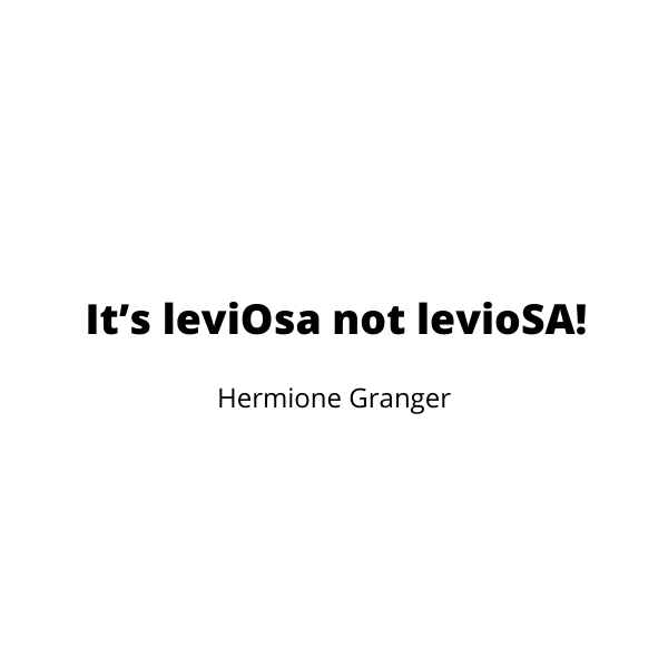
Not particularly inspiring or interesting on the wall right?
Now then, what if I was to try it in a graffiti font? One that isn’t standard or that everyone else is using. An exclusive font from Font Bundles perhaps…
I went browsing and found the “President” font which is currently on half price sale at Font Bundles.
It ticked the boxes I was looking for. Clear, easy-to-read, and graffiti-esq handwritten style.

Let’s see if using that makes a difference to the inspirational quote. The font is easily uploaded onto Canva Pro after purchase and download, making it simple to use in any of my designs now or in the future.
For now I wanted to see the difference President made to my Hermione Granger quote.
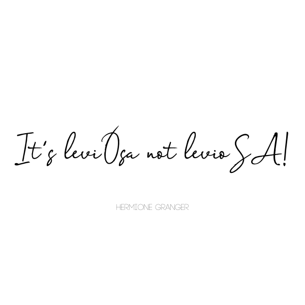
BINGO.
Already it looks more eye catching by using two different fonts. The graffiti font and the simple capital for Hermione Granger causes a stark contrast to the graffiti style.
The only thing that is needed on this quote now is a little bit of magic…
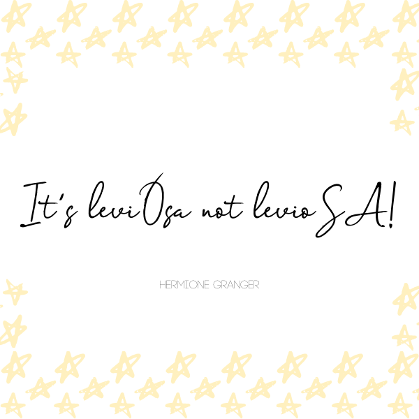
And just like that, with a little help from Canva and Font Bundles I’ve gone from having a boring, typed quote to something which catches the eye on the wall.
What else can you do?
Of course fonts are not only useful for some (pretty awesome if I say so myself) wall art. But also for my job.
Being a blogger, and a Facebook Social Media Manager, part of my job description is to create eye catching imagery to promote posts, inspirational quotes and designs that make you want to click through.
Once again, it is fonts that help to do that.
Your graphic needs to be eye catching amongst a sea of other graphics, be them pins, Facebook quotes, Instagram stories. You name it there will be millions of them. For example if you search “lasagna recipe” on Pinterest and you can scroll through pages and pages of pinned images.
Yes you need a beautiful image of a mouthwatering lasagna. But what if you don’t know what a lasagna looks like. Or that it’s not just a pin about the lasagna loving cat Garfield?
That’s where fonts come in.
They need to be clear enough to be read, and interesting enough to fit with your design.
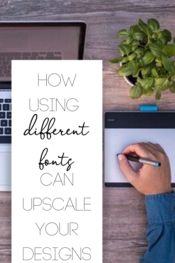
Designing a Pinterest Post
Just how do you go about designing a killer Pinterest post, with interesting, legible fonts, to get you that all important click through result you’re after?
Personally I start with Canva and use custom dimensions of 600px x 900px for a long, tall, thin pin. I don’t tend to bother using the templates that they have on offer (and they have a lot) as I prefer simple imagery and funky fonts.
Once you’ve picked your image, it’s time to get writing.
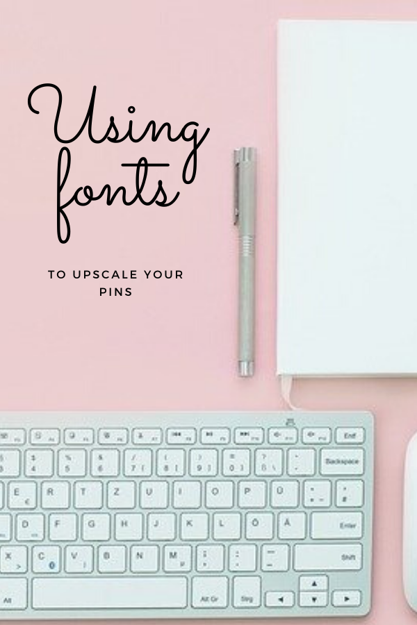
Sometimes an image is overly busy and if you try to type your title the words get lost in the image. If that’s the case I use text boxes to make the writing stand out and the image stays clear in the background.
Other times you have wide expanses of clear colour in your image that is just crying out for the words to be scrawled upon.
Final Thoughts
Fonts really can make or break a design. It’s tough to know which font to choose, or indeed find something that stands out from the rest of the crowd. That’s why Font Bundles is so epic – thousands of fonts to choose from, for every occasion and as they’re premium? Not everyone will have them.
What’s your style going to be?
